Rebranding London's Most Colourful Escape, Central Saint Giles: Brand identity Case Study

  • Project Title
    Central Saint Giles
  • Client
    Central Saint Giles
  • Category
    Brand Identity, Packaging and UX/UI design

Question

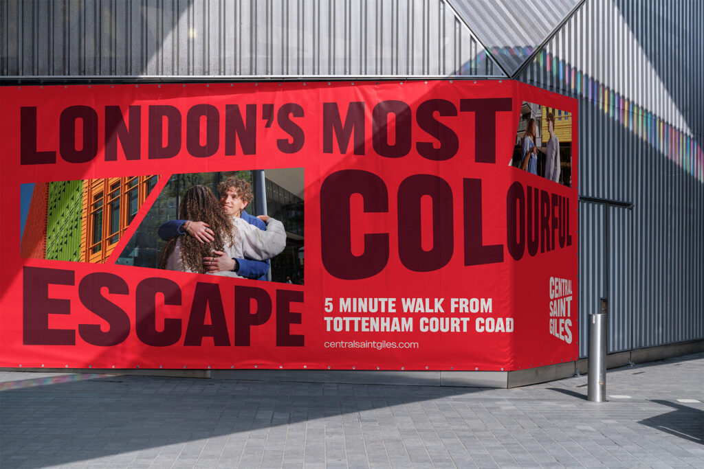
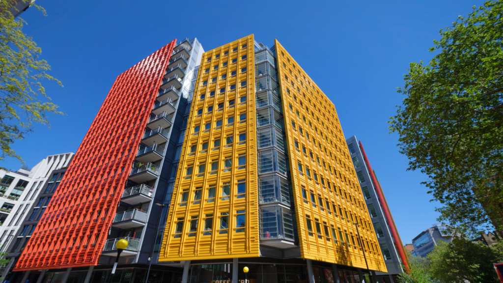
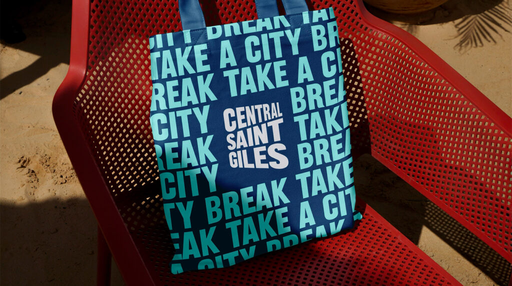
Central Saint Giles sits at the heart of central London, but despite its prime location and striking architecture, it has historically lacked a clear identity beyond being a place to pass through to get to other parts of London.

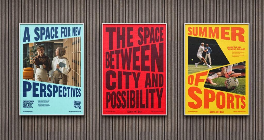
The challenge was to reposition Central Saint Giles as a distinct destination, in a way that reflects its unique character and helps it stand out in the city.

Read More

1.0 A BRAND BUILT ON THE ARCHITECTURE

Central Saint Giles Building Image

Change

We began with a creative workshop and in-depth research, analysing what truly sets Central Saint Giles apart. Three defining characteristics emerged: its colourful architecture, its welcoming piazza and its dynamic mix of uses and audiences throughout the day.  

From this, we developed a brand strategy centred around one big idea: Powered by Imagination. The architecture itself, which was designed by Renzo Piano, already embodies this by using colours and angles to create movement, contrast and surprise.  

Read More

2.0 BUILDING A COMMUNITY IN THE HEART OF THE CITY

Outcome

Central Saint Giles now has an ownable identity as London’s most colourful escape, which is deeply rooted in what makes the area unique. The brand captures its character and creativity, turning it from a route leading somewhere else into a destination in its own right 

Read More

3.0 SPREADING THE WORD

Say Hello

Like what you see? Need a hand? Want to work together? Send us an email and let’s chat.