Rebranding NCO: Brand Identity Case Study

  • Project Title
    To evolve a the National Children's Orchestra brand to appeal to a younger market
  • Client
    National Children's Orchestras
  • Category
    Brand identity, Brand Expression, Social Media, UX/UI Design

1/3

Question

NCO Brand Identity Brief

The National Children’s Orchestra (NCO) approached us a pivotal moment in their journey. Known for transforming young lives through the power of orchestral music, they needed a brand and website to properly reflect the vibrancy, creativity and diversity of their talented members.

Read More

NCO Brand Identity Assets

2/3

Change

NCO Brand Identity Concept

How can they connect to the younger audience?

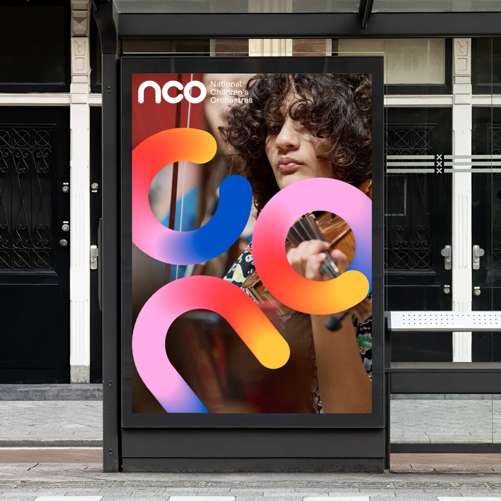
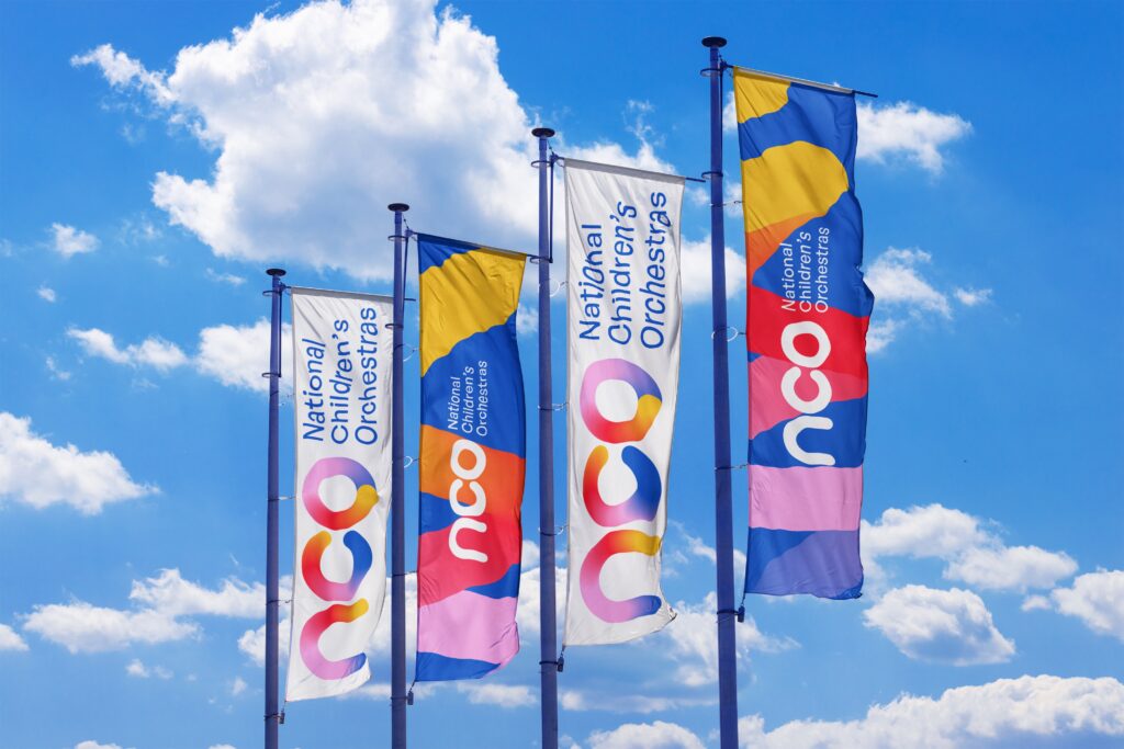
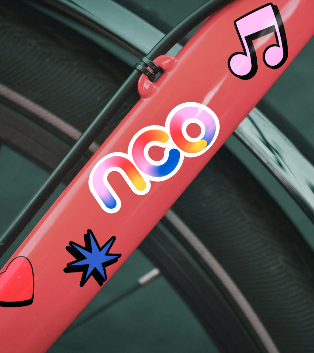
We created a brand identity that celebrates togetherness, teamwork and creativity.

Our brand mark is based around a singular circle – a form that’s built on togetherness. It represents the harmony between individuals and the collective power of the orchestra. It is a pure shape that holds space for everyone.

Read More

NCO Brand Identity Assets

3/3

Outcome

NCO Brand Identity

Developing the brand to inspire young minds.

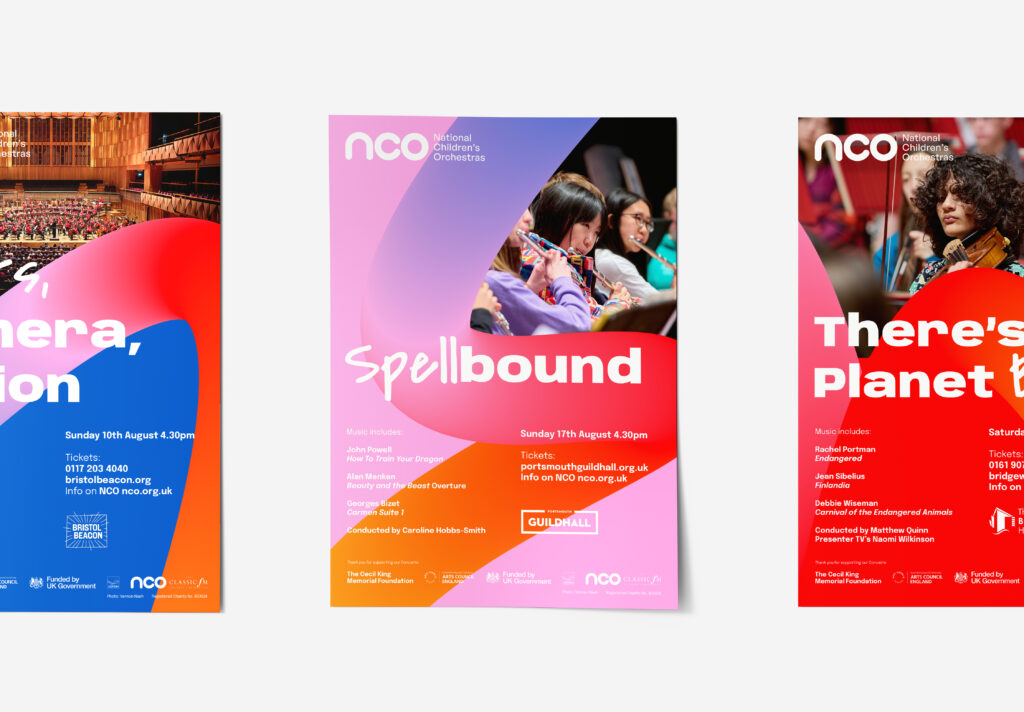
The new brand captures the NCO’s bigger picture. It’s not only about orchestral music but about teamwork, fun, building skills and opening up future possibilities. It has united their communications, made their offer clearer and built a powerful platform for growth and attracting new talent, supporters and partners. 

NCO Brand Identity Assets

NCO Brand Identity Assets

Say Hello

Like what you see? Need a hand? Want to work together? Send us an email and let’s chat.