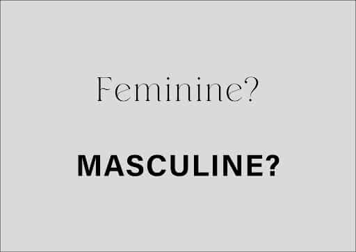
Does typography reinforce gender stereotypes?
tycadmin
I recently read a book by Marie Boulanger who explores how typography perpetuates gender stereotypes. The designer highlights how bold and confident lettering is often associated with masculinity, while delicate and ornamental typography tends to be deemed feminine.
Now you may ask, why does it matter? It’s only typography.

I am aware there are more important discussions happening in the world in regards to gender stereotypes, however I think it’s an interesting observation by Marie Boulanger that even a small detail like typography is reflecting wider society’s dated gender attitudes. And ultimately asking the broader question, “Why is being ‘feminine’ perceived to not be bold and powerful? It is worth noting that many well known brands today are discussing this topic and providing a more empowering message when it comes to gender stereotypes, however we still have a way to go.
This book made me reflect on my own experience as a designer, remembering times in my career I have most likely contributed to the narrative of “this typeface feels too feminine or feels to masculine”. For example, when developing a brand to be “powerful” or “confident”, why is my immediate thought to select a Sans Serif typeface? Now this could be simply down to my own personal design preference, however, subconsciously am I selecting a typeface because of the gender associations?
As someone who identifies as “male”, my design perspective could be influenced by the “male” orientated products I consume and as a result, influenced by the typography associated with these products. It is important to note, that in the UK, design is still largely dominated by men. The People, Places and Economic Value report, published by the Design Council this week, found that 77% of the country’s estimated 1.6 million designers identify as male. If a design agency is just one voice, the work is likely going to reflect the attitudes of a certain demographic.
At TYC we look slightly different, 62% of our designers identify as female. We are a makeup of different voices from all walks of life. As an evidential design agency, we undertake our own thorough qualitative and quantitative research, creating a vast pool of knowledge into what our customers and real people want. This information informs our thinking…we are not using our own bias because the facts are there. Our mix of design culture as well as design practice creates an output that is not only challenging ourselves and each other, but most importantly challenging the sector.
In order to ‘challenge’ the sector in this case, it’s actually quite simple, as designers we need to reflect and ask basic fundamental questions like “why can’t pink be used within a male orientated brand?”. These details might be considered trivial and small however, they make a big impact in the world of design and more importantly in contributing to societal attitudes.
So if my first contribution to this narrative is simply changing the cut of a typeface to challenge the norm, then why not?
