
Type To The Max
tycadmin
Often a trend comes along that feels very much ‘in the moment’ whether that be in fashion, interiors or design. But that’s a trend right? Most trends are reoccurring; they are everywhere for a year or so and then they fade into obscurity, ready to re-emerge in 10 years time.
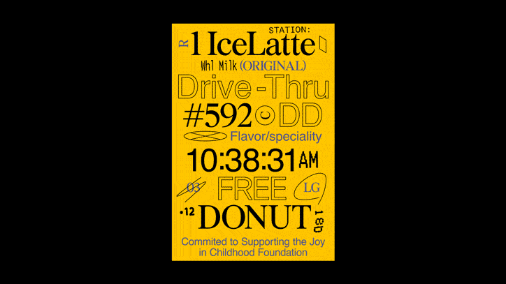
However, it feels, at least to me, that currently we are in new typographical territory. Designers are actively smashing together multiple fonts. Different characters push for space as designers actively test the limits of what is possible with typography. Combined with this maximalist approach is the style of fonts designers are utilising. It feels like all the rules are out the window currently and I for one, am hugely excited by where type is heading.
But don’t get me wrong, there is still a place for the minimalist approach. We all love the organised, grids, and Swiss style layout. It will forever be relevant as it has a timeless quality. Ernst Keller is still the King in my eyes. And I guess that’s the point. Don’t expect this typographic melting pot to stay around forever, but while it’s here, enjoy it!
Contrasting typefaces sit side by side, varying weights are used with abandon while designers pull and stretch characters to their limits. These are not easy techniques to get right. In the wrong hands it can look clumsy and forced. Studios such as Sagmeister & Walsh and KesselsKramer are pushing boundaries, proving there is an established market for this style.
Brands are keen to utilise this new visual language to appeal to a younger audience. Nike, for instance, has readily accepted the need for typographic flexibility within their brand. This has allowed them to remain relevant and fresh. However, it should be noted, this does not need to result in a convoluted look and feel with no consistency. Consumers themselves are more open to brands that flex and shift. In fact this typographic trend is more a pointer to a wider trend of flexibility within brands as a whole.
As brands become braver, designers feel more comfortable pushing typographic styles. We know that consumers can unpick and read this visual language. This makes for a more visually interesting end product and an industry of happy designers!
The TYC rebrand has taken learnings from these new waves of typographic trends, we are adapting to change, creating a more flexible and relevant brand. Our brand, whilst taking notes from Swiss styling and combining with these new typographic trends.
It’s certainly an exciting time for the world of typography. The questions is – where will it go next?