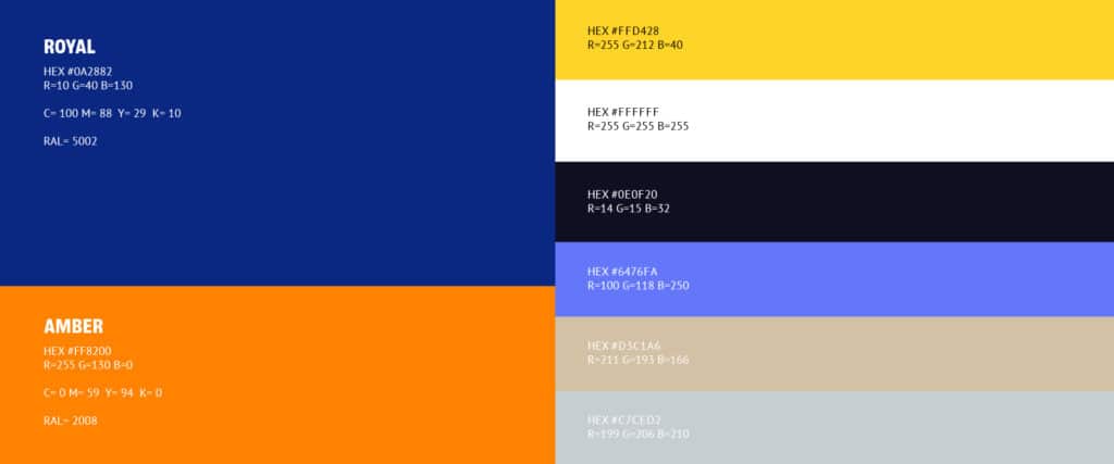
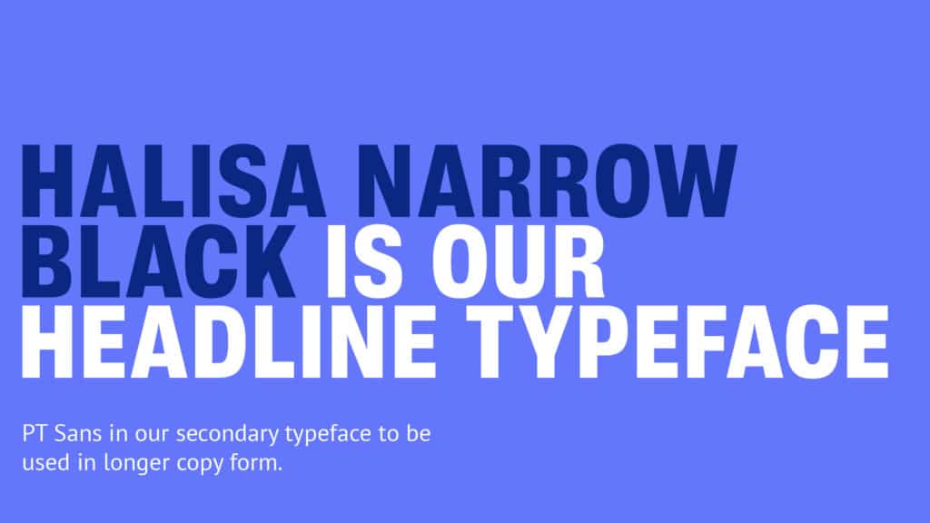
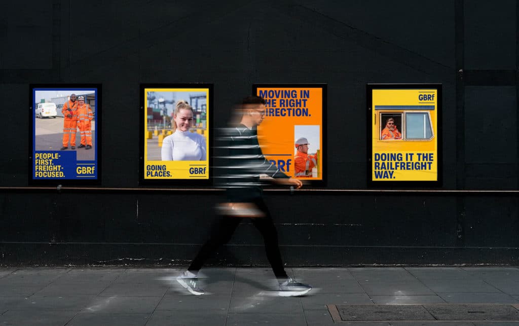
The primary focus for this brand overhaul was to ensure GBRf was ready for the digital world. With the aim to recruit large numbers of candidates online, they required an engaging online presence. Distinct new colours were added to the brand palette to support, attract and captivate their audience in a digital and commercial setting. Halisa Narrow was selected as the display typeface to carry the messaging of a new brand tone of voice – positioning GBRf as a dependable logistics service delivered by the best brains in the business. The new art direction and photographic style championed the people on the front (train) lines of the business. Inspiring a new generation of recruits and instilling the family ethos embedded within GBRf.
Our main aim for the new website was to create a digital home for GBRf. Showcasing the brand’s rich heritage, depth of knowledge, wealth of services and expertise. With a substantial focus on modern UI/UX principles, alongside a rejuvenated brand identity, the website became a fitting home for GBRf and a strong foundation for its recruitment drive.
Since its creation we have continued to help the business by writing and designing journals, providing data boards for AGMs, and design of merchandise, recruitment campaigns and newsletters.


