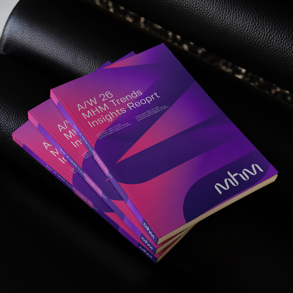
MHM Strategic Brand Identity Case Study

  • Project Title
    Transforming audience connection, strategy consultancy rebrand
  • Client
    MHM
  • Category
    Brand Identity, Brand Expression, U/UI Design

1/3

Question

MHM Brand Identity Brief

After 25 successful years, MHM found itself at a pivotal moment. With a bold new ambition in place – to lead the world in audience strategy – the organisation needed a brand identity to match.

Read More

MHM Branding Assets

2/3

Change

MHM Brand Identity Concept

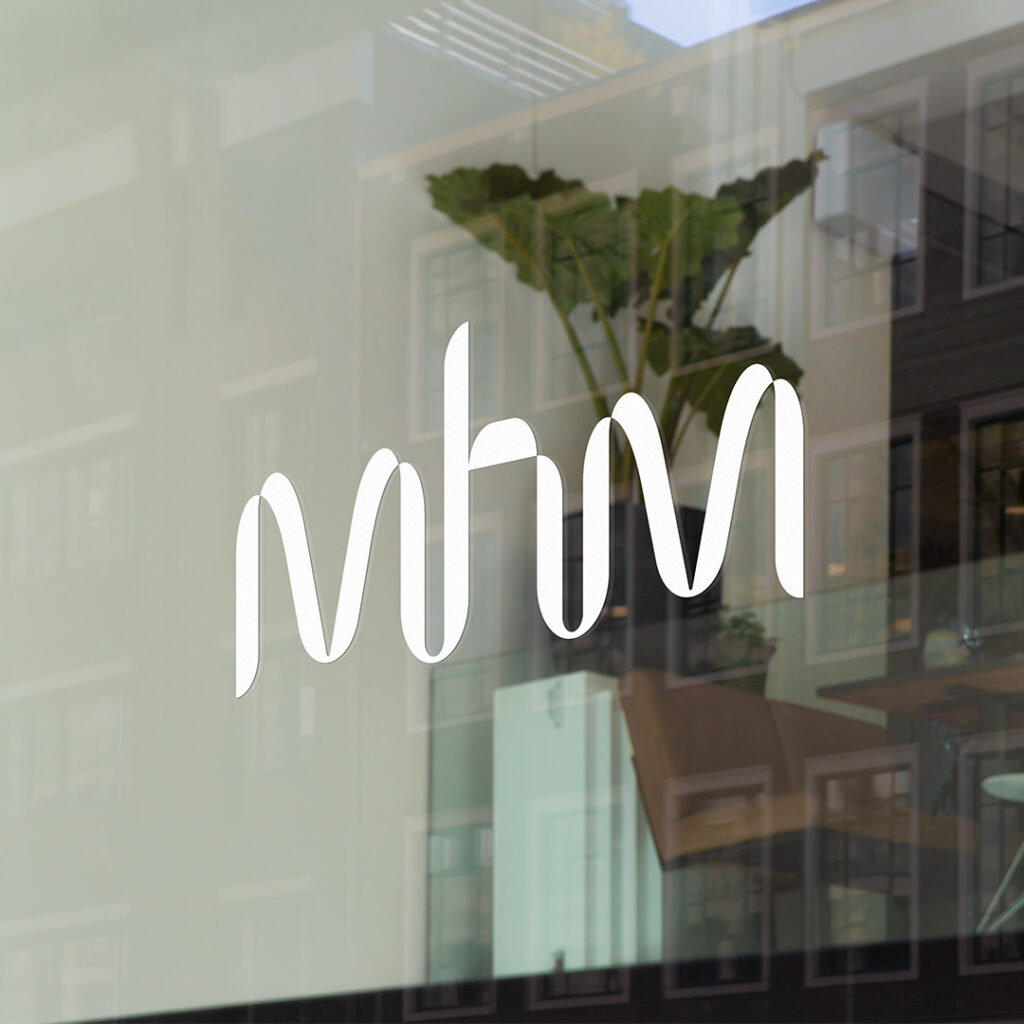
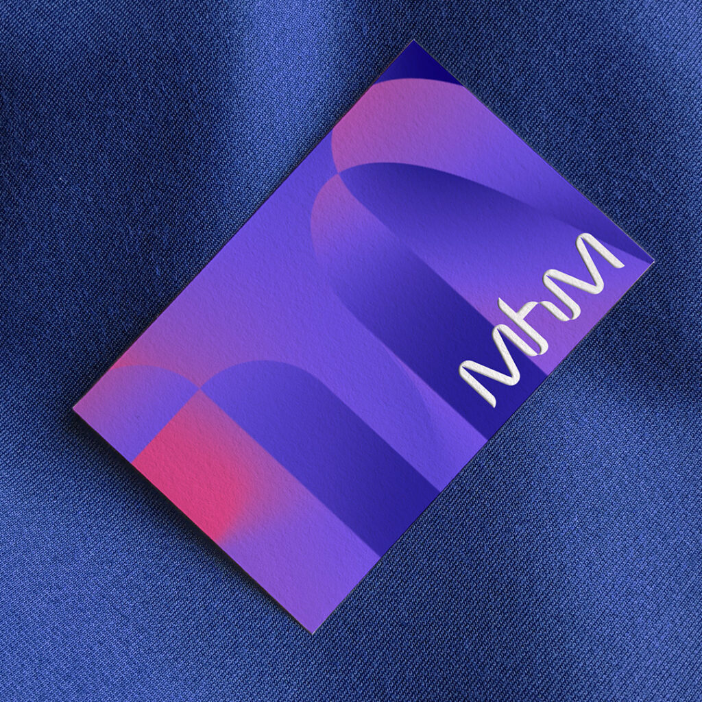
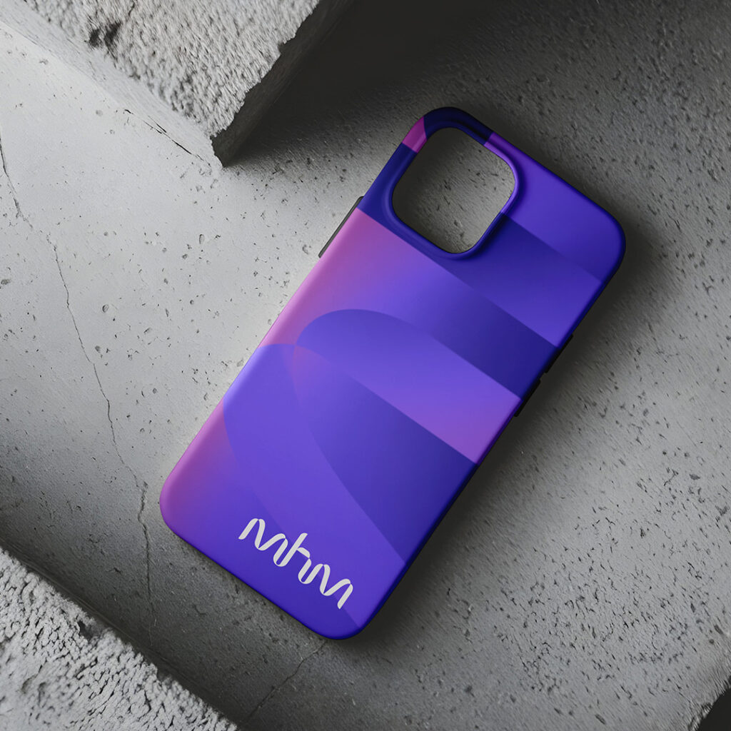
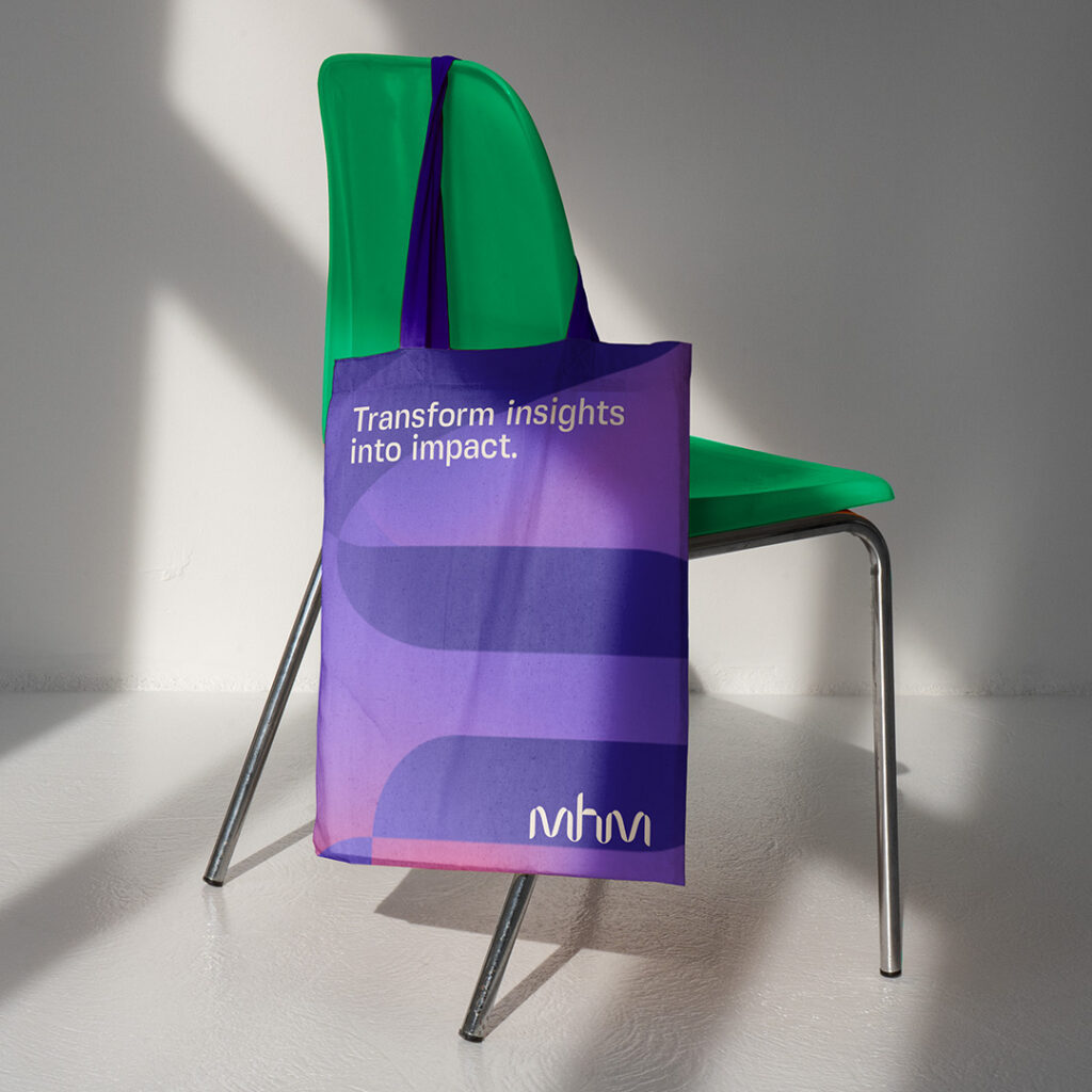
We created a brand identity designed to embody MHM’s purpose: to transform audience connection. At its core is a distinctive new logo mark, a bold signifier for the brand that remains consistent across all communications.

By mixing our primary colour palette of purple, blue, pink and teal, we create a fluid wave of colour and movement, while our graphic language creates a ribbon that connects the journey we share with our clients and audience.

Read More

MHM Brand Assets

3/3

Outcome

MHM Rebrand

The refreshed identity reflects MHM’s global strategic value. It has brought internal alignment and coherence and is used confidently across teams and roles. Externally, it stands out and makes MHM a memorable brand, reflecting its ambition and acting as a catalyst for transformation. 

MHM Brand Assets

Say Hello

Like what you see? Need a hand? Want to work together? Send us an email and let’s chat.