Our new look, TYC
tycadmin
Re-branding ourselves was never going to be an easy task but it was a necessary one. Turning nine years old in 2016 felt like the right time to refresh our visual identity in order to reflect that of our current position in the industry.
We wanted to get to the core of what The Yard Creative stands for and what makes us or the way we work different to other design agencies. We needed a more considered mark that embodied us as a creative agency and what we stand for.
Exploring and breaking down our core values during a creative day, attended by the whole team as well as some external influencers, was a useful exercise and our core values were defined as:
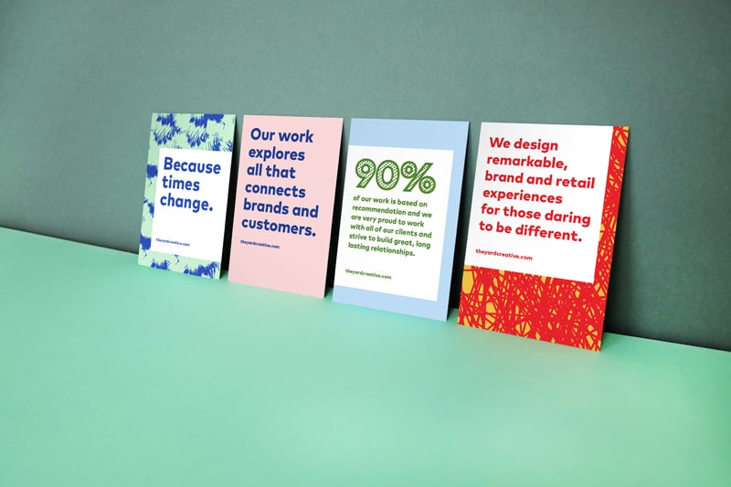
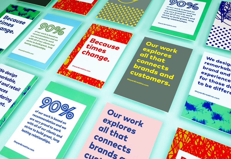
Unique. Flexible. Fearless. Remarkable. Supportive. Fun.
Something that we kept returning to during our exploration was the fact that we are always questioning. Why do something a certain way? Why not push a concept even further?
Being a design authority for our clients and questioning everything to generate the best possible result is extremely important to who we are, which is why we made it the centre of our logo mark. TYC.
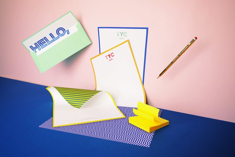
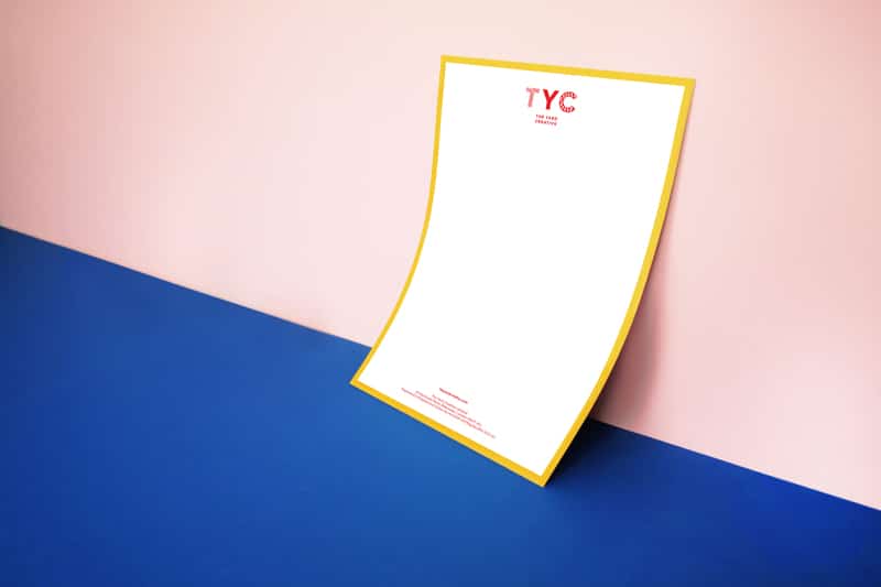
The logo mark itself is made up of two elements; firstly, the typeface used is FF Mark, a geometric sans, strong, simple and created with utmost consideration and precision, the typeface perfectly expresses our bold and confident nature.
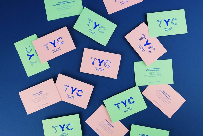
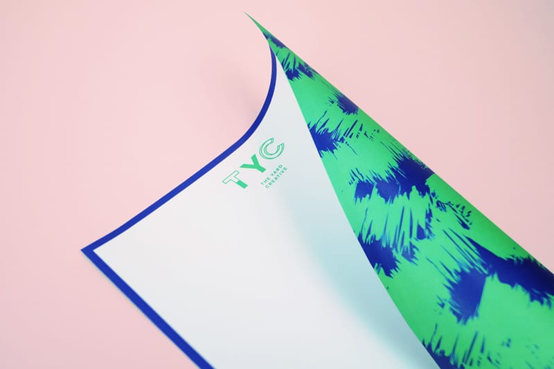
The second element is a monogram, TYC. The monogram is a mix of solid and outline letters.
The Y remains solid at all times to represent the consistent questioning approach that is at the heart of every single thing we do.
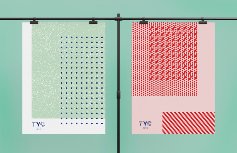
The T and the C are outlined, leaving the interior space free to house another two of our brand values, flexibility and uniqueness. These letters can be filled with a variety of custom-drawn patterns designed to demonstrate the transferrable skills that we can apply to any number of client demands and the broad range of our creative practice.
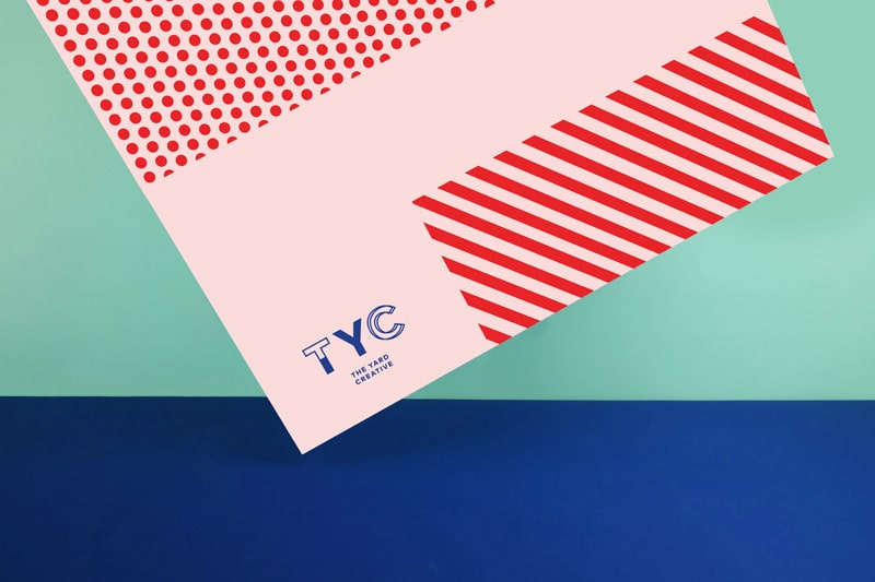
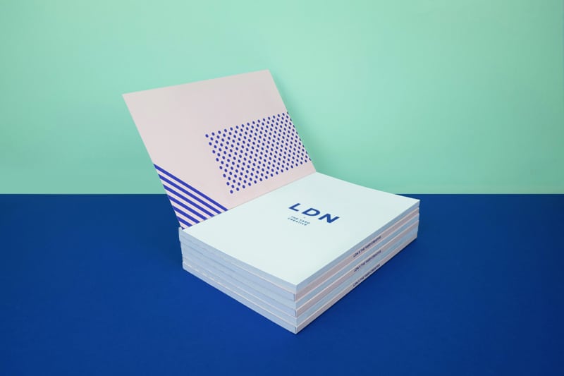
There is an endless catalogue of logo variations through which the individuality and character of The Yard Creative can be expressed. Everyone has a different logo on his or her business card and the same logo is rarely seen twice on any piece of brand material.
The outcome is more of a fit than we could have ever hoped. Our visual identity is the perfect combination of authority and flexibility, echoing our core values and expressing who we are.